
Turbo Dork Paint range review for Miniatures & Wargames Models
Last Updated on April 23, 2021 by FauxHammer
The Turbo Dork range is a Totally Radical range of metallic paints and I use that word without an ounce of shame. Especially as this range’s screams 80s neon. Cowabunga! (yeah, this is gonna keep happening). Let take a look at these paints in our Turbo Dork Metallics Range Review.
To Summarise, these are some Righteous paints! If there were a competition for a range of miniature paints with the best colour names. Torbodork would get first, second and third place. They have good coverage are fairly easy to use when applying them with either a brush or an airbrush.
Note, The colour shift paints are called Colorshift, I’ll do my best to refer to the product as Colorshift. However as I’m in the UK, if I’m not referencing the product name directly I will revert to my natural method of spelling and refer to them as Colour shift.
The Best Paints for Miniatures & Wargames Models
This article is part of our series looking at The Best Paints for Miniatures & Wargames Models.
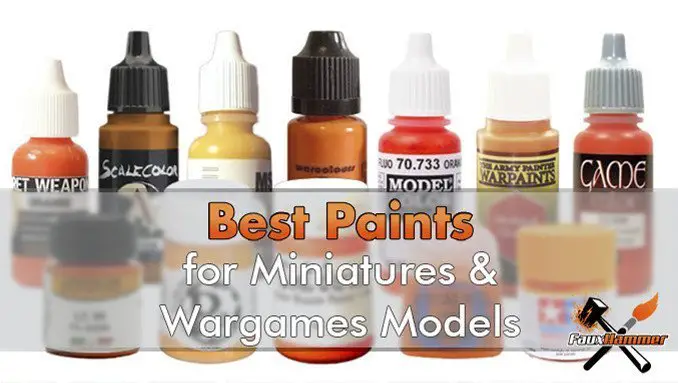
If you want to check out what the best paints are for your projects, please check out our Best Paints article by clicking the image above.
Turbodork Metallic Paints – Packaging and Unboxing
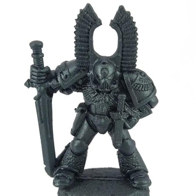
So, this is normally the part of the review where I show you the unboxing. But these didn’t come in a box. Ok, well, they did come in a box. I just mean there was no “retail” branded box which they came in. All of these paints came loose in a shipping box. The only packaging was some push seal jiffy bags.
I like this, in 2019 there is no need to waste money on packaging when it’s not necessary so until you see retail boxes on the shelves with the various Turbo Dork collections. you will be getting your bottles as plain as they can be. But they still look Bodacious.
As for collections, Turbo Dork currently sells the following bundles;
- Volume 1 Colorshift
- Volume 1 Metallics
- Bright Lights – Paints which work well over white
- B-Sides and Rarities – Paints which didn’t fit in the other categories
- Every Acrylic Paint
Whilst there is no unboxing, the bottles are worth mentioning.
First of all, dropper bottles. Tick!.
Second, agitator already included in the Tick.
20ml of paint per bottle (some of the largest standard bottles of any model paints range). Tick!
All of the labels are printed on metallic film. This is great becasue there is a clear block on each label showing what the paint will look like once applied, shininess included. This is genuinely quite useful, especially for the colour shift paints. Is it’s impossible to tell what some of these paints will look like by staring at the medium in the bottle. More on this later.

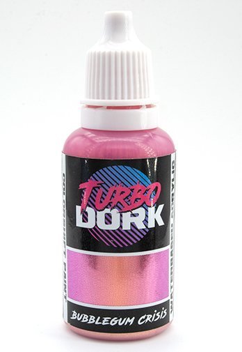
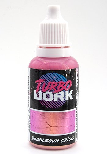
Bubblegum Crisis – New Bubblegum Crisis – Used
I do have one (teeny-tiny pathetic) gripe here. Due to the metallic film, as you squeeze the bottle you cause horrible creases in the label. This wouldn’t matter is the labels themselves weren’t so damn sexy. But because they are, these creases are pretty Bogus.
The mixing balls are Stainless Steel, ut they are quite small, I actually thought they were plastic until Turbo Dork gave me the correct details. I prefer heavier metal balls (do not put that on my gravestone). The smaller ones have a tendency of getting stuck in the thicker settled medium. A good slap on a tabletop will usually dislodge them anyway. And the fact that agitators are even included still keeps this in the win column. I know other manufacturers who “need” mixing balls and charge you extra for them.
Turbo Dork Metallic Paints – Colours
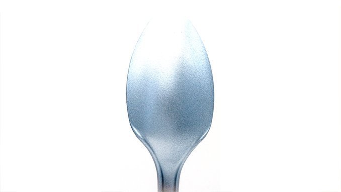
Before I take you through the colour selection, let me tell you a story about how awesome these paints are. Below, to test the paints, I painted spoons. A ton of spoons. I posted a picture of these spoons on Instagram, Facebook & Twitter with a simple caption “SPOOONS! At the time, this was the single most popular post I had ever had, people were liking commenting and sharing for days after the post. I genuinely asked people to stop but the community wanted more.
If that doesn’t exemplify how awesome these colours are, maybe stop reading here. nah, don’t be a Dweeb, keep reading.
For the below colour samples sprayed spoons. with Black Primer on the outside and White Primer on the inside. I then gently misted the Torbodork colours over the surface until it was fully opaque. This was to see how the primer colour affected the metallic and how many layers I needed to cover the pant.
I’ve also made sure the lighting was the same in every image to give a direct view of how they look
All Turbo Dork paints are metallic and fit into one of three categories. Metallic, Colorshift & Flourish.
Turbo Dork Metallic Paints – Reds
See what I mean about the names
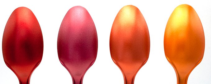
Shown above are the colours over a black primer. each took only 3 light coats to give the deep and rich colours you see here.
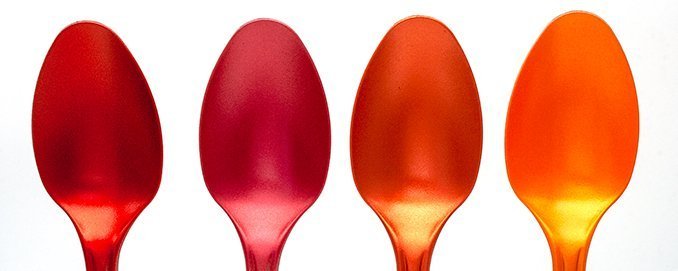
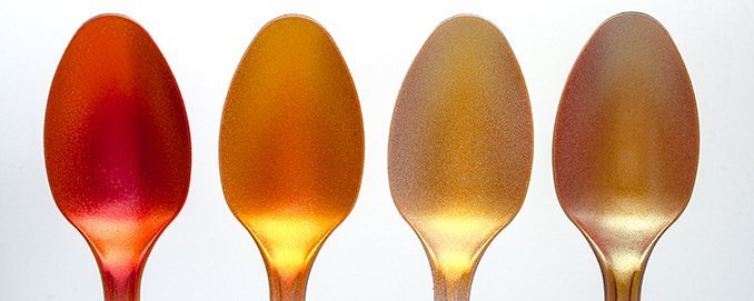
The same colours applied over white Primer are equally as rich as those above. These however required 5 coats.
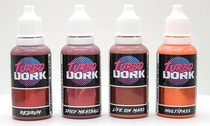
I just want to say here, that Multipass (the orange on the right) is my favourite paint from this series and the next article I write about them will feature a bright orange Space Marine Bike (or 3).
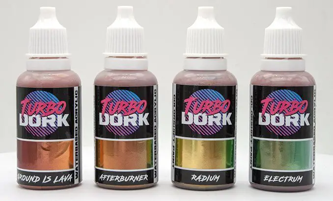
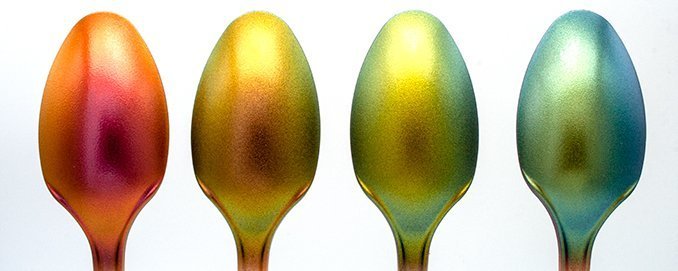
Turbo Dork Metallic Paints – Browns & Yellows
I’m gonna say right now. Dark Net should not be here. it’s a colour shift paint and I didn’t realise when I was grouping the colours for photos. By the time I realised I had already taken all the pics and balanced them out for showing 4 spoons per image. So I wasn’t going back to take more images and rebuild the groupings.
We will look at Colour shift paints in their own section later, but I’ll touch on this one now.
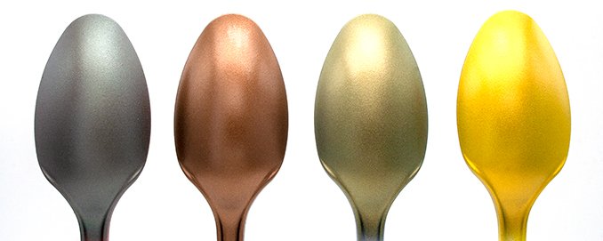
3 coats over black and we’ve got some really vibrant colours. You’d be forgiven for seeing Death By as a Bronze and Pucker as a Gold. And you can certainly use them as such But they really are more of a metallic brown and metallic yellow.
Dark Net is a very subtle grey-green colour shift.
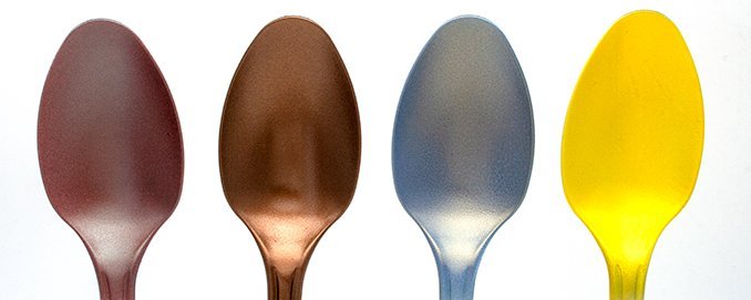
Dark Net has completely changed here over white and you’ll see this more with the other colour shift paints later on. it’s an interesting colour but I just can’t think where I’d ever need a grey/dirty-salmon shift. If you can, I’d love to see it.
Ill-Gotten Gold has also changed, how to a silver. it’s rather nice in all honesty and I can see where a Black/White zenithal pre shade will get you some cool effects with this. Again, I wonder why this happened as it is not a colour shift paint.
Turbo Dork Metallic Paints – Greens
It’s great to see a range of metallic greens. I have only 1 metallic mini from my childhood and it was painted metallic green. It’s a rare colour to find amongst miniature paints (most of these colours are, to be honest).
Also, did you know that the human eye can see more shades of green than any other colour? If you didn’t know that, go watch Fargo Season 1.
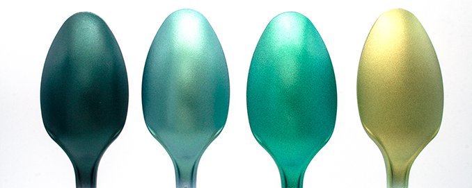
Again 3 coats. but look what’s happened to Malum Malus on the right. this isn’t green. it’s more of a greenish-gold. I genuinely have no idea how or why this happened. It’s not a colour shift paint. Let’s see what it’s like over white
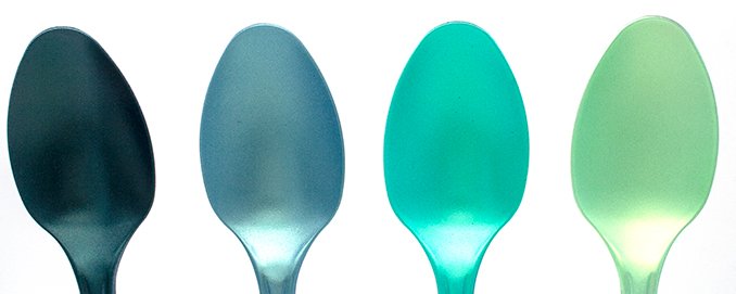
Once again we have very similar colours over white, but this time it also took 5 coats. Malum Malus which was gold above is now closer to it’s expected colour. although it’s still not quite as rich as the bottle suggests. this was a bit of a pity as the colour on that bottle is one i’d really like to paint with.
Turbo Dork Metallic Paints – Purples
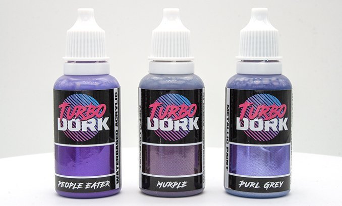
Again some really bright and vibrant colours
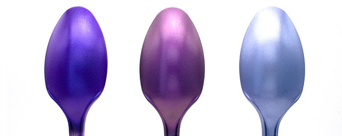
3 coats, People eater came out just a touch bluer than expected, but it really depends on the lighting. these images were taken under some pretty high power lights which increases some of the subsurface hues.
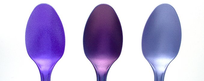
Perfect coats over white, again, 5 layers
Turbo Dork Metallic Paints – White
One is the loneliest number that you’ll ever do. and there is only 1 silver White Metallic paint in this list.
In all honesty, this is a silver, but you can tell that what Turbo Dork was going for was a metallic white and boy is it close. It doesn’t quite have the chrome finish the bottle shows but a bright shiny white.
For example. remember how I said above I used the same lighting on all of these images. well I probably should have balanced the lighting against this colour first. Becasue I didn’t this colour is so bright, I’ve lost a lot of the spoon due to overexposure. Genuinely though, this should show just how white this paint is. It just happens to be metallic too.
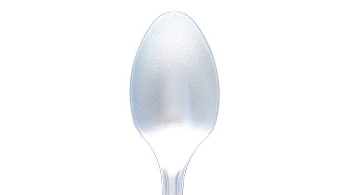
Over white, it’s even lighter. yet it still managed to keep metallic properties.
Anyway, that’s all the metallic paints covered.
Turbo Dork Flourish Paints – Colours
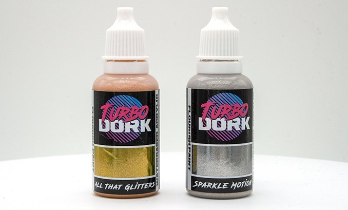
Turbo Dork has 2 paints in what they refer to as flourish paints for special use cases. Like larger more glittery pigments, or special effects.
I can understand why the Silver is in the Flourish paints list as it is shiny and glittery.
But unless I’ve used it wrong the gold paint, just looks like a normal bright gold. If you look at this now and go back to Pucker in the yellows section, you can really see why I said that one was metallic yellow. When put next to each other, Having All that Glitters in the Flourish category just makes me wish the gold was more glittery like the silver.
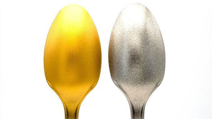
All that Glitters is pretty much the same over white, it just takes more layers to get it on.
Sparkle Motion over white, we’ve lost a touch of that sparkliness in Sparkle Motion. this is just becasue you can’t see the black through the pigment gaps so it doesn’t. stand out as well. It’s still got its pigment though.. ALmost like those Christmas Baubles you get. the ones with the glitter that goes everywhere when you touch them.
I’m going to mark Turbo Dork down here, only becasue Sparkle Motion is not called Disco Ball. – Come on guys, what are you playing at!
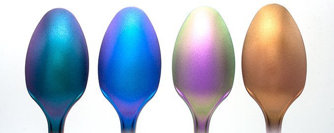
Turbo Dork Colorshift Paints – Colours A
These paints will have you Spazzing Out. I love colour shift paints. they truly stand out like nothing else. however I have found that they show off best over larger surfaces where you can see a gradual curve from one colour to another.
I wouldn’t overuse them either. They look good but painting every surface of your model with a colour shift of some kind can appear quite jarring. instead, try and swap out a mode’s primary colour for a colour shifting paint and watch how it suddenly pops on the tabletop.
They work best over black however they took around 5 layers to fully apply. Gloss black apparently but from what I have seen all the gloss does is give them a glossier finish. it doesn’t increase the colour shifting amount or make them brighter. These spoons were painted over matte black. No additional clear costs have been applied. This is neat Turbo Dork paint you are looking at.
Electrum is screaming Alpha Legion at me
When I said above they work best over a black coat, it’s actually safe to say they hardly work at all over white. But this is on par with what I have seen with other colour shifting paints. Only Ground is Lava actually shows any real similarity with itself over a black coat, however, even then the colour shift is severely diminished.
I didn’t count the layers over white as I gave up after several coats when I realised I’d never get the shift to work.
Turbo Dork Colorshift Paints – Colours B
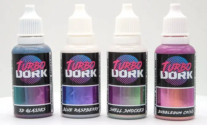
The final 4 colour shift paints are equally psychedelic colours looking at the bottles.
However, after application, some of the colours don’t quite have the same level of pop. 3D Glasses & Shell Shocked are awesome colours and I can’t wait to apply them to models. Blue Rasberry is nice although the shift is rather subtle. I have no idea what happened with Bubblegum Crisis. It is just gold. even looking at the spoon now and bending it in the light, I can’t see any pink.
(Update on Bubblegum Crisis in the next section)
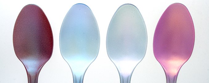
Once again over white the colours simply don’t pop and lock shift as they do over black. Blue Raspberry and Shell Shocked are essentially now just a metallic white, similar to how the medium in the bottle looks when it’s neat. This isn’t useless though, this pearlescent white does have some metallic species, similar to how metallic white cars look. BubbbleGum Crisis is now pink with only a slight shift to gold. perhaps this is one colour that should be applied over white. But nothing on the bottle indicates this, it says prime in black like all the others.
Update on Bubblegum Crisis: After speaking with turbo Dork, they confirmed that this is meant to be used over a white base. There was actually an error on the original labels where is said prime in black just like all the others. On the newer print runs, it has corrected this.
Turbo Dork Metallic Paints – Application to Models
The best thing about Turbo Dork isn’t the paints themselves, and the paints are really good. The best thing is that you’re never short for some Gnarly inspiration. On Instagram, they post their own examples and re-post some of the best models painted using their paints (So I guess my model below didn’t make the cut, or maybe I’m just too much of a Wannabe).
It can be tricky to truly plan what models to paint with these wild colours. Overuse of them can be garish unless the model is intended to be fully metallic. For the models I paint, I found it’s best to have a mix of Turbo Dork metallics with some flatter base colours. This suits my painting style.
If you are struggling with ideas on where you would apply these. Head over to their Instagram page to see what other great artists have done.
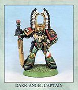
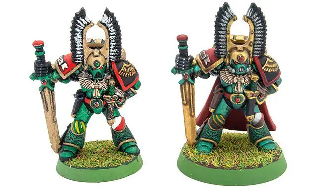
For me, there was only 1 model in mind. Repainting a Classic Dark Angel Model I painted Metallic Green, back when I was 13. This scheme of this model was from the pages of the 1993 ‘Eavy Metal Painting Guide. I think the model (as with all in this publication) is by Mike McVey but it is uncredited in the book.
Over a Black Primer, I applied just 2 thin coats of Emerald Nightmare. This Should have been 3 for even coverage. but I new the additional layers I was applying and wanted to save some surface detail. This gives a nice subtle hint of metallic green.
We applied this with an airbrush as with the spoons above. one thing I’m not sure I mentioned is that these paints applied through the airbrush directly with no need for any thinner.
Turbo Dork have since (they sent me these paints) updated their paint formula so they are now thicker and may require a little paint thinner. The paints will last much longer now which is pretty Rad.
For the main base layer, I applied Absinthe. The intent was to have this as a zenithal highlight. but It just looked too stark against the dark green and with the heavy metallic pigment, I couldn’t get the blend right. I ended up just recoating the model from the front to cover most of the Emerald Nightmare. It is still slightly visible under the Knees and the sword arm.
On close inspection, you can actually see the individual metallic flakes which make up the pigment. This is quite consistent with any metallic model paint.
We’ve also had some detail loss, it’s slight, but if you check the gem on the main sword and belt buckle with the image above. You can see we are losing the edge between the jewel and its socket. But we are about 7 layers in from the undercoat now.
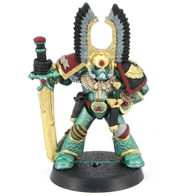
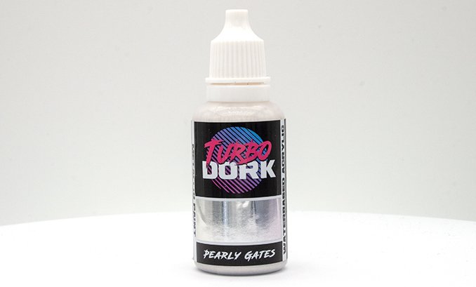
Here we applied the base colours. The metallics used were All That Glitters for the gold and Pearly Gates for the Silver. Both Paints were applied with a brush. All that Glitters was applied directly over the Absinthe base. Pearly Gates was applied over areas we repainted black.
All that Glitters coverage was excellent, especially to say it was over the green directly. It’s also left us with a really smooth almost mirror-like (for a model) gold colour. This is one of the best golds I have used outside of Enamel based metallic paints. Although, for its name, it is less “Glittery” than most of the other paints.
Pearly gates came out darker with the black undercoat (as expected from the spoons) but I needed a silver look to match to my old model. This applied nice and smooth after 3 coats.
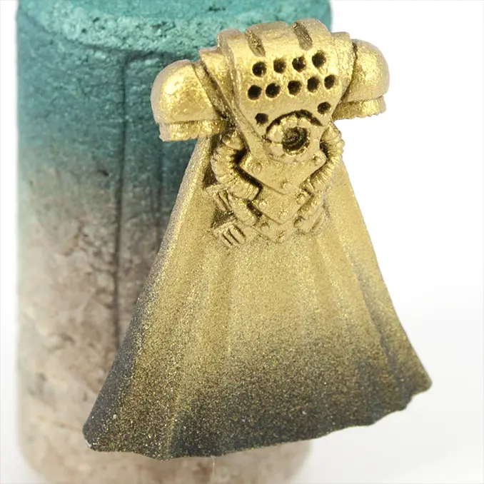
We also applied All that Glitters over the backpack using an airbrush. This has given it a more glittery appearance. You can also see on the lower part of the cape how the spray really speckles, this is why I struggled to create blends with the green above.
Even though the example model in the shot and my old model don’t have a cape. I actually wanted to use it on this updated guy as it comes with him.
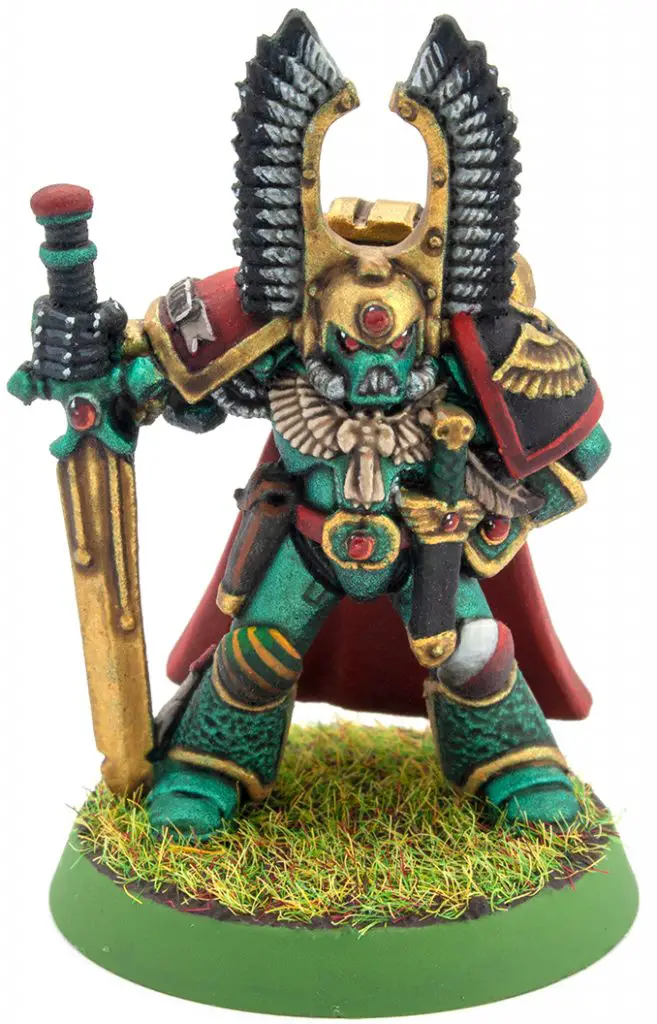
The model was completed by giving it a Gloss Clear Coat and a liberal wash before the highlights and details were added. It’s great to see the metallics show through a solid shade coat and whilst it has toned down the shine (Which I like) the metallics still stand out as original and different.
I’m quite proud of this guy, even though he was a bit of a rush job, it shows off what a great range of paints these truly are.
Will Turbo Dork Metallic Paints Improve My Hobby?
If you are looking for bright coloured metallic paints, then yes, yes they will. Whilst there are some quirks to using them like any metallic paint. They are still some of the easiest to use through an airbrush or even when brushing them on.
If you aren’t looking for bright metallic paints, check out Turbo Dork’s Instagram before dismissing them as you may suddenly get some Phat inspiration, like I have many times.
It’s great that Turbo Dork shares lots of the work the community creates. This helps to showcase their range and opens viewers eyes to some of the great painters out there.
If the colour shift paints interest you. Just like with all their paints, You can also see a direct example of their application to a model on every individual colour page Turbo Dork’s website. Which has recently been re-launched.
One thing I do miss from their old site is that the example pictures of models were much larger. You could see more detail. I’m sure they can tweak this and I hope they do.
Check out their page of review videos & tutorials too.
Turbo Dork Metallic Paints – Final Thoughts
| Pros | Cons |
| Bright range of Coloured Metallics Great Application through Airbrush Great Brush Application Sexy Bottles Great Inspiration Resources Tutorials and Guides Supports/Shares Community work | Labels Crease When Squeezed Sparkle Motion not called DiscoBall |
If the only cons I can come up with are that the labels crease and that I (personally) think they missed a trick with one of the names. then this alone should show you how great I think these paints are.
They aren’t perfect, they aren’t high-density pigments that cover in one coat, but very few paints are. When it comes to acrylic metallics, it’s about a balance of getting the right volume for physical flecks of pigment with the right amount of medium to maintain a smooth flow.
They are however some of the best at what they offer – A Totaly Wicked range of bright shiny coloured metallics.
What did you think of this Review? please let us know in the comments.
If you like what we’re doing here you could really help encourage more content with a share on any social media platform.
Click the share links at the bottom of this screen (or on the left for computers and tablets)
Want to keep updated with the blog? You can subscribe in the sidebar for RSS or by email below
(Sidebar is below the article on Mobile Devices)


I’m sure you are aware of this by now and maybe they have changed it on the updated website. Some of the colors are meant to be painted over black, white or zenithal primed pieces. Some like the pucker ,bubblegum malum malice are meant to be applied over a color like yellow, pink, or green. I’ve just found this paint and I’m truly enamored by it and reasearching the heck out of it. Pretty cool stuff